Track360: designing for the three minutes a CFO has before the board meeting. 🖌️
$590M across 100+ transformation initiatives, tracked across scattered PowerPoint decks, Excel trackers and status meetings that rebuilt the same picture every week. I led the end to end design of an executive command centre that let a global beauty company's C-suite move from reporting to deciding, in a single view.
Requirement synthesis → information architecture → user flows → wireframing → high-fidelity UI → prototyping → stakeholder reviews → engineering handoff
Outcome: from status meetings to a single decision-ready view.
- Led the UX process from discovery through high-fidelity design
- Structured a fragmented data ecosystem into one IA
- Directed AI-accelerated concept exploration
- Delivered React-ready specs in 3 weeks
- User flows for executive drill-down
- Component specs and engineering handoff docs
- Interactive prototype for stakeholder walkthroughs
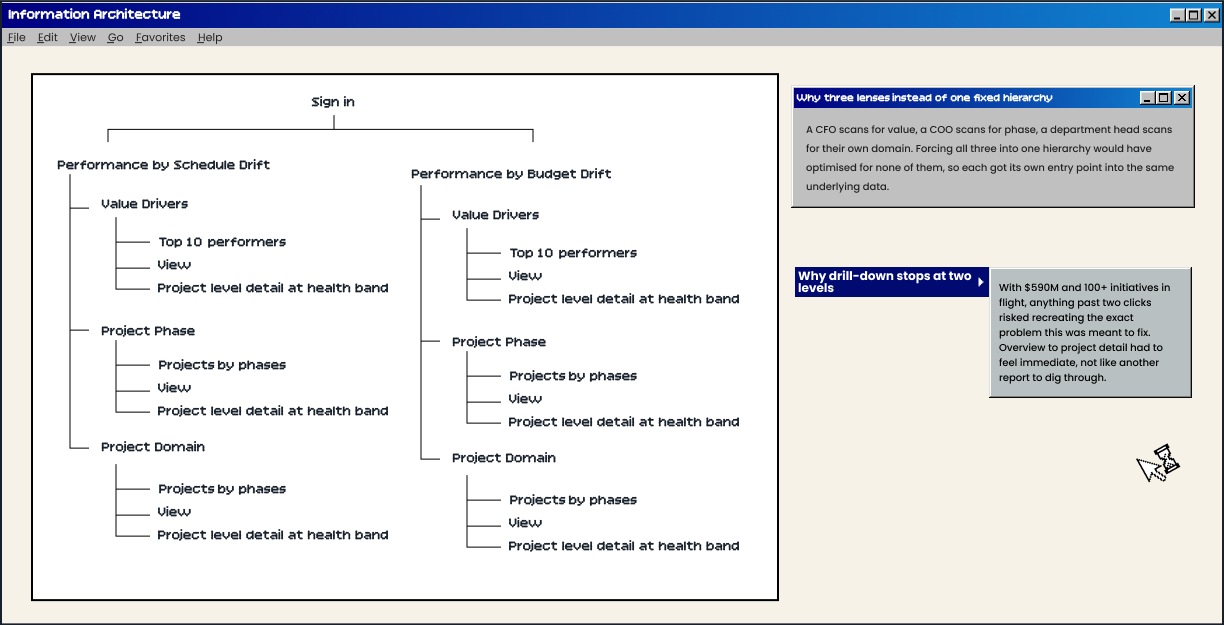
- Information Architecture
The problem was not missing data. It was missing shape.
The client did not need more information. They already had all of it. What they did not have was one place to look, and one shared definition of what "on track" meant.
- Fragmented → updates spread across PowerPoint decks, Excel trackers and recurring status meetings, with no single source of truth
- Manual → every status meeting rebuilt the same picture from scratch, by hand
- Duplicated → the same numbers were reformatted and re-presented for different audiences, again and again
- Invisible → with $590M and 100+ initiatives in flight, no single view showed where the real risk was sitting
Research here meant structuring, not discovering.
The client came in with a defined vision and complete data. They told us plainly: "We have all the data you need, we just don't want it to look like another dashboard." That changed what research had to do.
STATUS IS NOT INSIGHT
Executive dashboards are scanned for deviation first, detail second. Leadership needed to see what was off before they needed to know why.
ONE METRIC, FOUR DEFINITIONS
Inconsistent KPI definitions across departments were quietly eroding trust in the numbers themselves, not just the reporting process.
THE REPORT WAS ALWAYS LATE
Manually assembled updates meant leadership was always looking at where the portfolio used to be, not where it actually stood.
The core experience: three lenses on one portfolio.
Instead of one dense table trying to serve every executive, Track360 gives each of them their own way into the same $590M.
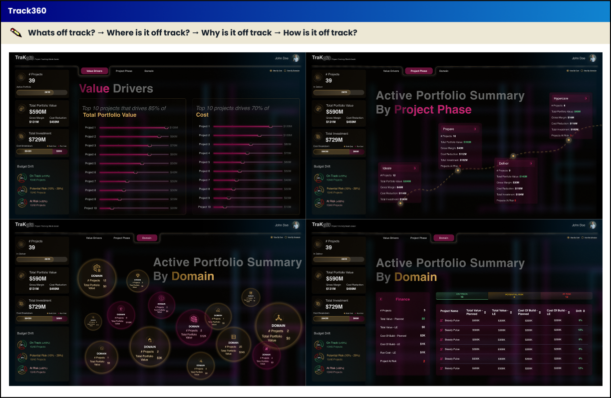
The final interface turns $590M into something you can read in seconds.
There was no room in three weeks for a formal V1 to V2 pass on screens. The real iteration happened earlier, in deciding what kind of product this would even be.
- Multiple concept passes explored fast using Figma Make, Framer and Lovable
- Several read as familiar BI dashboards: dense tables, generic bar charts
- Fast to produce, but risked looking like every reporting tool the client already had
- A visual, story-driven command centre built around three entry points, not one dense table
- Ranked value-driver sliders and a domain map replaced generic charts
- Direction confirmed with the client before locking high-fidelity work in Figma
Value Drivers ranks what matters most. The domain map and project phase level shows where the portfolio actually lives, further drill down to project level details
What Track360 says about how I work.
The strongest part of this project is not the visual polish. It is what happened when the timeline and the research budget both disappeared.
MOVE FAST WITHOUT LOSING RIGOUR
Three weeks, no interviews, complete client data. I still built the structure through evidence, not guesswork, just compressed.
DESIGN THE DECISION, NOT THE DATA
Every screen exists to answer one question: what does this person need to decide right now.
USE AI AS LEVERAGE, NOT A SHORTCUT
Figma Make, Framer and Lovable helped explore directions fast. The judgment on which direction to ship stayed mine.
"This is something that doesn't exist anywhere in our company. It's truly one of a kind."
"Additional 4 client engagements"