PRODUCT DESIGN · NEONATAL CARE · MOBILE + WEB

NeoPulse: designing for the moment a vital sign turns critical, the chart that logs it. 🖌️

One neonatal ward. Dozens of infants. A doctor who can't watch every monitor at once, and caregivers recording vitals by hand with no shared, live view of who needs attention. I designed a connected caregiver-to-doctor experience turning bedside recordings into ward-level visibility, so no warning signs missed!

MY CONTRIBUTION

Product thinking → clinical & competitive research → vital parameter framework → information architecture → user flows → wireframing → hi-fi UI → interaction design

ROLE
Product Designer
DURATION
3-day design sprint
PLATFORM
Android · Web Dashboard
USERS
Caregivers · Doctors
01

Outcome: a system that surfaces the signal, not just the log.

15
High-fidelity screens across mobile + dashboard
7
Existing neonatal monitoring products analysed
9
Vital & workflow parameters proposed with clinical justification
✓ My ownership
  • Led the UX process from discovery through high-fidelity design
  • Proposed & justified the vital parameter set
  • Ran competitive teardown of 7 real products
  • Designed two distinct, connected experiences
🗂️ File📌 Ownership🕐 12:00 PM
✓ Deliverables
  • Personas · caregiver & doctor
  • Competitor analysis · 7 products
  • Vital parameters framework
  • Information architecture · both experiences
  • Hi-fi UI · mobile app + dashboard
🗂️ File📌 Delivery🕐 12:00 PM
02

The problem was not missing data. It was missing timing.

Commercial teams had the data, but not a shared way to understand it or act on it.

⚠️ DANGER: Where should my focus be?!
  • Fragmented — vitals recorded by different caregivers, no shared live view across the ward
  • Manual — a doctor relies on periodic rounds and verbal handoffs to catch a change
  • Delayed — an abnormal reading has no path to a doctor's attention until the next check
  • Undifferentiated — a stable baby and a critical baby carry the same visual weight until someone actively looks
THE UX QUESTION
"If a doctor has 90 seconds between rounds, what does the doctor need to see first?"
and how fast can the doctor move from -
"something changed" → "Heres the Baby that needs attention"
✏️
03

Research changed what "monitoring" meant in this product.

Without direct clinical user access, I treated assumptions carefully: competitive teardown, clinical parameter research, and workflow mapping were pressure-tested with AI-assisted perspective simulation, not presented as validated findings.

Competitor teardown across 7 products·Clinical parameter research·Workflow mapping·Mental-model analysis·AI-assisted perspective simulation

TWO CLOCKS, ONE BABY

Caregivers work in the moment. Doctors work across many moments at once. A shared record isn't automatically a shared view.

NOT ALL VITALS ARE EQUAL

Reviewed products mostly logged every reading with the same visual weight. Clinical urgency wasn't part of the design language.

FLAT ALERTS, NO HIERARCHY

Every product surveyed pushed notifications as a flat list. None separated "worth a look" from "needs a doctor now."

Evidence
Insight
Design response
7 competitor products reviewed logged vitals but treated every entry with equal visual priority
Doctors don't need more data — they need triage
Criticality becomes a first-class visual signal, not a filter you have to apply
Caregiver and doctor workflows never overlapped in any reviewed product's navigation
A shared database isn't a shared experience
Two distinct interaction models, joined by one connected data spine
Vital parameters varied widely across devices and apps reviewed, with little visible justification
Parameter choice is a clinical design decision, not a checklist
Propose a defined vital set with explicit reasoning, not "log everything"
04

The core experience: from bedside entry to ward-level decision.

Instead of designing two apps around a shared database, I designed one connected loop around the moment that matters — a vital changing status.
Record
Caregiver logs vitals at the bedside
→
Ward overview
Doctor sees the full baby population & status
→
Alert surfaces
Abnormal readings escalate automatically
→
Baby detail
Doctor opens full context for that baby
→
Daily summary
Ward-level pattern review across shifts
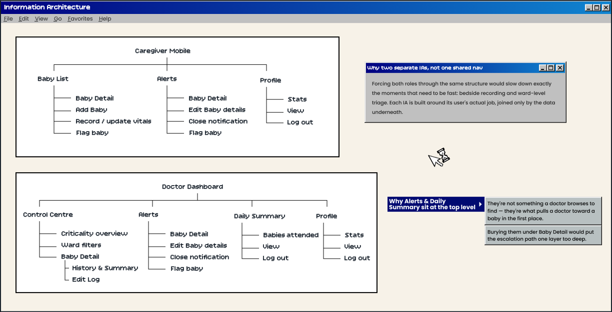
NeoPulse information architecture — Caregiver Mobile and Doctor Dashboard
Why two separate IAs, not one shared nav — Forcing both roles through the same structure would slow down exactly the moments that need to be fast: bedside recording and ward-level triage. Each IA is built around its user's actual job, joined only by the data underneath.

Why Alerts & Daily Summary sit at the top level — They're not something a doctor browses to find — they're what pulls a doctor toward a baby in the first place. Burying them under Baby Detail would put the escalation path one layer too deep.
05

The final interface makes the escalation path visible.

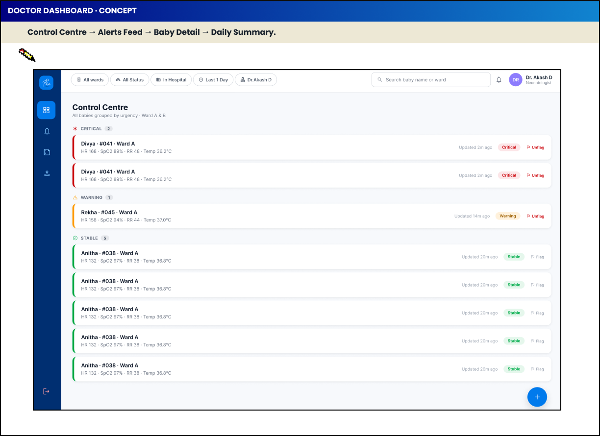
Caregiver capture stays fast and task-focused. The doctor view leads with what needs attention, not a wall of even data.
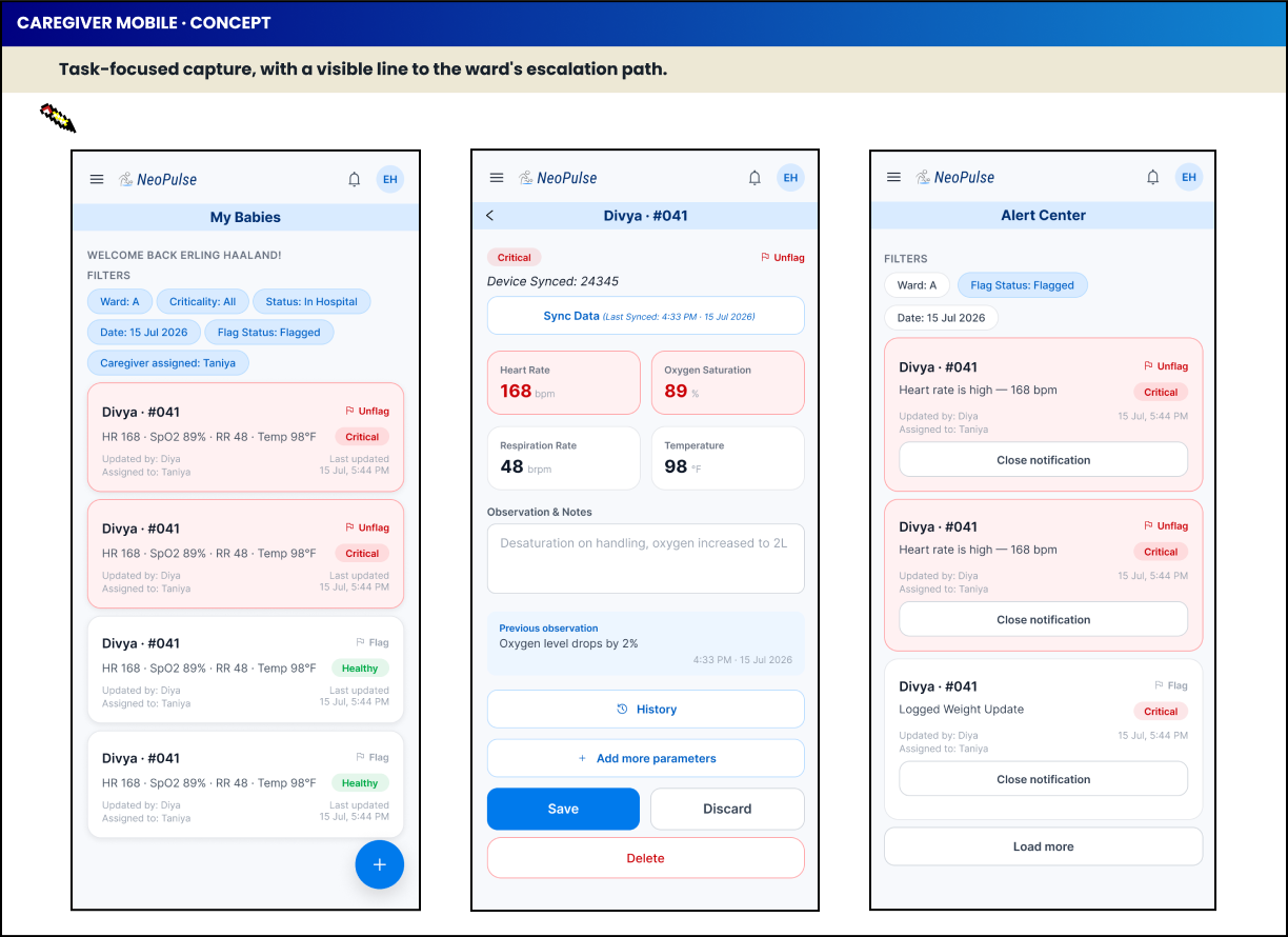
NeoPulse caregiver mobile concept screens
NeoPulse doctor dashboard concept

Good healthcare UX should connect information to the person who needs it next.
My approach is simple: understand the ecosystem, separate user mental models, map the information flow, and design each surface around the user's actual context.

NeoPulse • Product Design Case Study • Madura Sankar
VIEW OTHER CASE STUDY BACK