Launch Analytics: designing for the decision, not the dashboard. 🖌️
Five data sources. Two teams. One fragmented view of launch performance. I designed a role-aware analytics experience that helped commercial teams move from a headline KPI to the underlying driver — without getting lost in the data.
UX discovery → information architecture → user flows → wireframes → high-fidelity UI → prototyping → Power BI handoff → user documentation
Outcome: less reporting, more decision-making.
- Led the UX process from discovery through high-fidelity design
- Translated business and analytics requirements into role-based workflows
- Prototyping and handoff
- Collaborated with teams
- Journey / workflow maps
- Wireframes V1 & V2
- Information architecture
- Component specifications
- Power BI-ready layouts
- Interaction / handoff specs
- User manual
The problem was not "more data."
Commercial teams had the data, but not a shared way to understand it or act on it.
- Fragmented — Campaign data spread across multiple vendor systems.
- Siloed — HCP and DTC teams operated with different reporting cadences and mental models.
- Delayed — Static weekly reports arrived 3–5 days late.
- Not actionable — Managers could see headline performance but not the driver behind it.
- No benchmark — Partner/vendor comparisons required manual merging.
Research changed the shape of the product.
I combined stakeholder discovery, workflow analysis, existing-report review and iterative usability feedback to identify where the current experience broke down.
DIFFERENT MENTAL MODELS
HCP and DTC teams interpreted "performance" differently, so a single generic view created friction.
BACKWARD-LOOKING REPORTING
Weekly static reports made it difficult to respond during an active campaign window.
HEADLINE ≠ DIAGNOSIS
Users needed a path from a KPI anomaly to the partner, vendor or campaign driving it.
The core experience: diagnose in a few steps.
Instead of designing around data tables, I designed around the user's decision path.
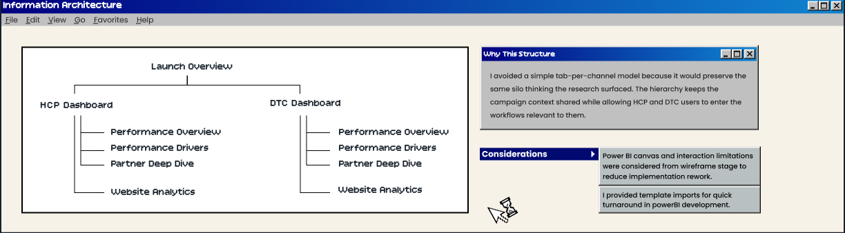
One iteration that mattered.
The design evolved because the research changed the information model — not because the visual style needed another pass.
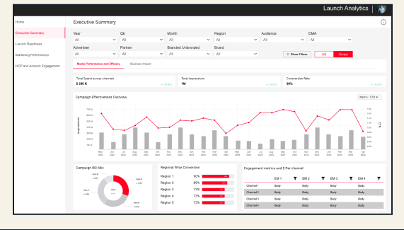
- HCP + DTC information in one dashboard
- Higher cognitive load for different user groups
- Weak path from KPI to root cause
- Information hierarchy driven by available data
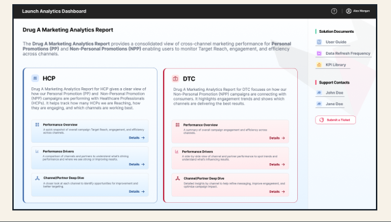
- Distinct HCP / DTC experiences
- Executive summary before detail
- Drill-down hierarchy built around diagnosis
- Power BI constraints embedded early
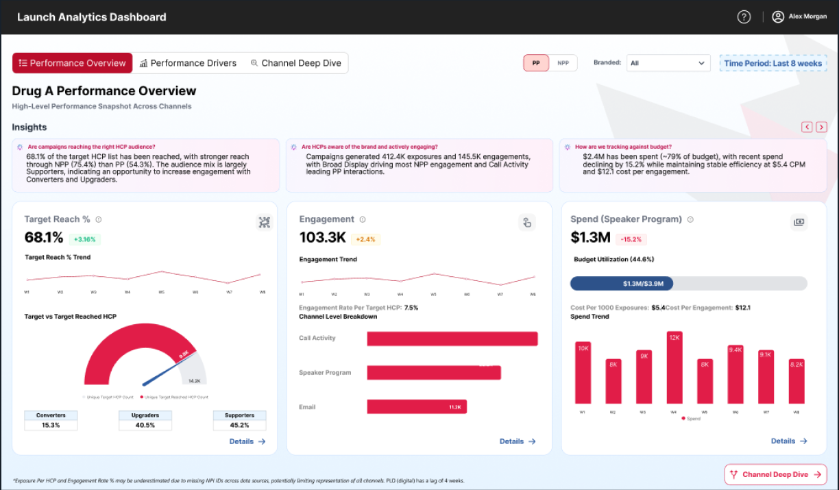
The final interface makes the decision path visible.
A clinical, data-forward UI uses hierarchy rather than decoration: KPI first, drivers next, then the details needed to act.